
What Idea about pe band chart ?
The PE Band Chart is a dynamic visual representation of stock market valuations by plotting historical Price-to-Earnings (PE) ratios against the index level. This chart enables investors to identify potential overvalued or undervalued conditions in the market, assisting them in making more informed investment decisions.
Components:
Index Level: The horizontal axis of the chart represents the index level, which can be any major stock market index such as the S&P 500, NASDAQ,SET Index, or Dow Jones Industrial Average. The index level serves as a proxy for the overall market performance.
PE Ratio: The vertical axis of the chart represents the Price-to-Earnings ratio, a commonly used valuation metric. It is calculated by dividing the market price of a stock by its earnings per share (EPS). The PE ratio helps investors gauge whether a stock or market is overvalued or undervalued.
Time: The chart’s data points are plotted over a specified time period, allowing investors to analyze historical trends and detect patterns in market valuations.
PE Bands: The chart displays a range of PE bands (e.g., 10-20, 20-30, etc.), which represent different valuation levels. The width of the bands can be customized to fit the user’s preference.
Color Coding: The data points within each PE band can be color-coded to represent the frequency or percentage of occurrences within each band. This helps investors easily visualize the distribution of historical valuations.
Import pandas and matplotlib
import pandas as pd
import matplotlib.pyplot as plt
Import Dataframe from excel
data= pd.read_excel('set.xlsx',index_col=0)datawe will see dataframe like this
| Prior | Open | High | Low | Close | PE | |
|---|---|---|---|---|---|---|
| Date | ||||||
| 2016-01-04 | 1288.02 | 1286.29 | 1286.36 | 1260.96 | 1263.41 | 22.12 |
| 2016-01-05 | 1263.41 | 1267.20 | 1270.07 | 1251.87 | 1253.34 | 21.99 |
| 2016-01-06 | 1253.34 | 1249.82 | 1260.88 | 1247.89 | 1260.04 | 22.10 |
| 2016-01-07 | 1260.04 | 1237.81 | 1244.04 | 1224.83 | 1224.83 | 21.46 |
| 2016-01-08 | 1224.83 | 1232.31 | 1246.70 | 1228.18 | 1244.18 | 21.81 |
| … | … | … | … | … | … | … |
| 2021-10-28 | 1627.61 | 1626.27 | 1632.30 | 1622.56 | 1624.31 | 20.81 |
| 2021-10-29 | 1624.31 | 1627.01 | 1629.25 | 1619.14 | 1623.43 | 21.02 |
| 2021-11-01 | 1623.43 | 1627.54 | 1632.73 | 1611.39 | 1613.78 | 20.89 |
| 2021-11-02 | 1613.78 | 1616.86 | 1621.69 | 1608.64 | 1617.89 | 20.96 |
| 2021-11-03 | 1617.89 | 1620.90 | 1623.08 | 1607.72 | 1611.92 | 20.87 |
1422 rows × 6 columns
data['EPS']=data.Close/data.PE
data| Prior | Open | High | Low | Close | PE | EPS | |
|---|---|---|---|---|---|---|---|
| Date | |||||||
| 2016-01-04 | 1288.02 | 1286.29 | 1286.36 | 1260.96 | 1263.41 | 22.12 | 57.116184 |
| 2016-01-05 | 1263.41 | 1267.20 | 1270.07 | 1251.87 | 1253.34 | 21.99 | 56.995907 |
| 2016-01-06 | 1253.34 | 1249.82 | 1260.88 | 1247.89 | 1260.04 | 22.10 | 57.015385 |
| 2016-01-07 | 1260.04 | 1237.81 | 1244.04 | 1224.83 | 1224.83 | 21.46 | 57.075023 |
| 2016-01-08 | 1224.83 | 1232.31 | 1246.70 | 1228.18 | 1244.18 | 21.81 | 57.046309 |
| … | … | … | … | … | … | … | … |
| 2021-10-28 | 1627.61 | 1626.27 | 1632.30 | 1622.56 | 1624.31 | 20.81 | 78.054301 |
| 2021-10-29 | 1624.31 | 1627.01 | 1629.25 | 1619.14 | 1623.43 | 21.02 | 77.232636 |
| 2021-11-01 | 1623.43 | 1627.54 | 1632.73 | 1611.39 | 1613.78 | 20.89 | 77.251316 |
| 2021-11-02 | 1613.78 | 1616.86 | 1621.69 | 1608.64 | 1617.89 | 20.96 | 77.189408 |
| 2021-11-03 | 1617.89 | 1620.90 | 1623.08 | 1607.72 | 1611.92 | 20.87 | 77.236224 |
1422 rows × 7 columns
add pe band
data['PE15x']=data.EPS*15
data['PE17x']=data.EPS*17
data['PE19x']=data.EPS*19
data['PE21x']=data.EPS*21
data['PE23x']=data.EPS*23
df=data[['Close','PE15x','PE17x','PE19x','PE21x','PE23x']]
df| Close | PE15x | PE17x | PE19x | PE21x | PE23x | |
|---|---|---|---|---|---|---|
| Date | ||||||
| 2016-01-04 | 1263.41 | 856.742767 | 970.975136 | 1085.207505 | 1199.439873 | 1313.672242 |
| 2016-01-05 | 1253.34 | 854.938608 | 968.930423 | 1082.922237 | 1196.914052 | 1310.905866 |
| 2016-01-06 | 1260.04 | 855.230769 | 969.261538 | 1083.292308 | 1197.323077 | 1311.353846 |
| … | … | … | … | … | … | … |
| 2021-11-01 | 1613.78 | 1158.769746 | 1313.272379 | 1467.775012 | 1622.277645 | 1776.780278 |
| 2021-11-02 | 1617.89 | 1157.841126 | 1312.219943 | 1466.598760 | 1620.977576 | 1775.356393 |
| 2021-11-03 | 1611.92 | 1158.543364 | 1313.015812 | 1467.488261 | 1621.960709 | 1776.433158 |
1422 rows × 7 columns
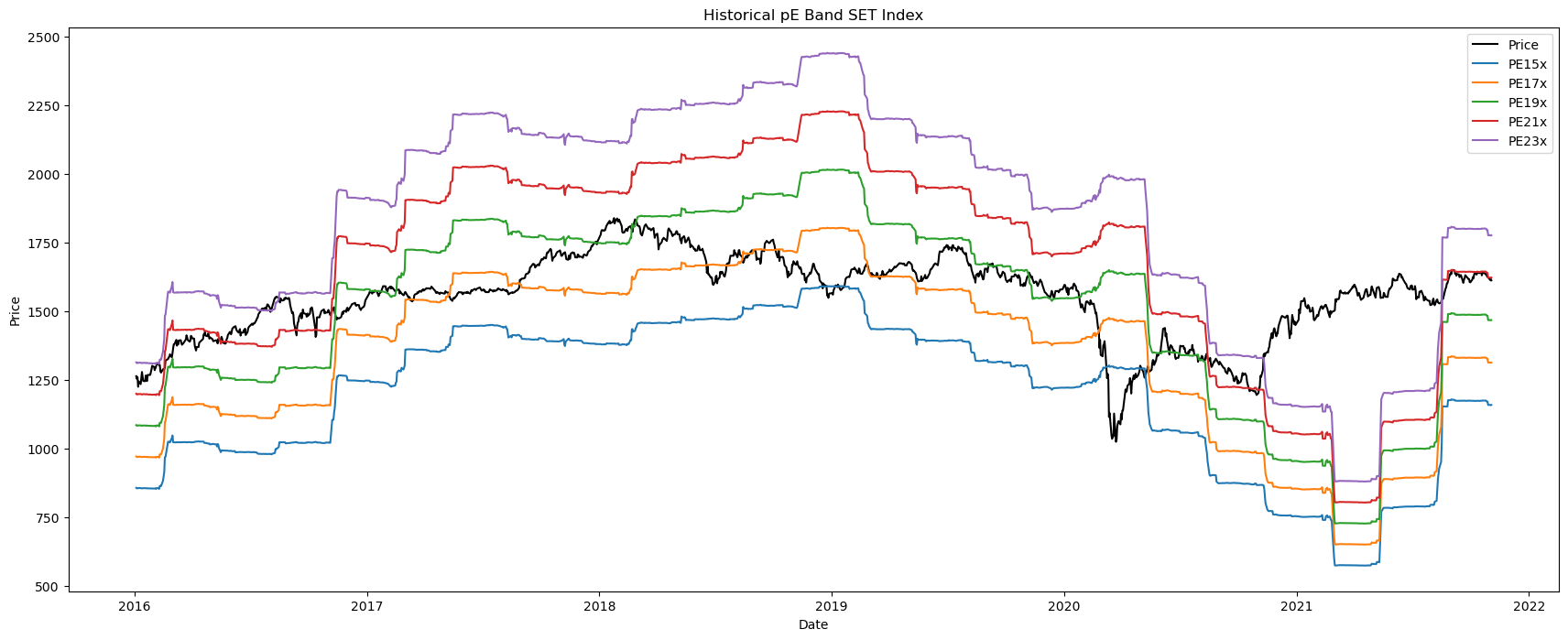
plot graph with PE Band
plt.figure(figsize=(21,8))
plt.plot(df.index,df['Close'],color='black')
plt.plot(df.index,df['PE15x'])
plt.plot(df.index,df['PE17x'])
plt.plot(df.index,df['PE19x'])
plt.plot(df.index,df['PE21x'])
plt.plot(df.index,df['PE23x'])
plt.legend(('Price','PE15x','PE17x','PE19x','PE21x','PE23x'))
plt.title('Historical pE Band SET Index')
plt.xlabel('Date')
plt.ylabel('Price')
plt.show()
How to Use the PE Band Chart:
Analyze historical trends: By observing the movement of the index level against the PE ratio, investors can identify historical trends, such as periods of overvaluation or undervaluation.
Assess market conditions: The chart can be used to gauge the current market’s valuation relative to historical levels. This helps investors determine if the market is overvalued, fairly valued, or undervalued.
Make informed investment decisions: By using the PE Band Chart to assess market conditions, investors can make more informed decisions on when to enter or exit the market, or whether to adjust their portfolio allocations.
Monitor and adjust: Investors can use the PE Band Chart as a monitoring tool, updating the data and analysis periodically to stay informed on market trends and valuation levels.
Conclusion
The PE Band Chart is a powerful tool that combines index levels with PE ratios to provide a visual representation of market valuations over time. This helps investors make more informed decisions by identifying potential overvalued or undervalued market conditions. By incorporating the PE Band Chart into their investment strategy, investors can better navigate market fluctuations and optimize their portfolio performance.