
What Idea about bubble chart ?
A bubble chart is an effective way to visualize equity data, allowing us to perform a top-down analysis of various factors such as market capitalization, Return on Equity (ROE), and Price-to-Book Value (P/BV). In this tutorial, we will walk through the process of creating a bubble chart using Python’s pandas and matplotlib libraries.
Step 1: Import pandas and matplotlib Start by importing the necessary libraries:
import pandas as pd
import matplotlib.pyplot as plt
Step 2: Import Dataframe from Excel Read the data from an Excel file and store it in a dataframe:
data = pd.read_excel('Data.xlsx',engine ='openpyxl')dataHere’s what the dataframe should look like:
| Stocks | ROE | PBV | MARKETCAP | |
|---|---|---|---|---|
| 0 | SAWAD | 22.56 | 3.87 | 86851 |
| 1 | MTC | 26.43 | 5.57 | 125610 |
| 2 | TIDLOR | 13.34 | 3.87 | 80584 |
| 3 | AMANAH | 21.02 | 3.31 | 5230 |
| 4 | AEONTS | 26.36 | 2.52 | 45750 |
| 5 | ASK | 14.42 | 2.16 | 18606 |
| 6 | CHAYO | 9.83 | 4.88 | 11444 |
| 7 | JMT | 20.86 | 6.59 | 51346 |
| 8 | KTC | 26.35 | 5.91 | 143097 |
| 9 | MICRO | 11.54 | 3.67 | 6872 |
| 10 | MTC | 26.43 | 5.57 | 125610 |
| 11 | NCAP | 19.81 | 5.10 | 9360 |
| 12 | S11 | 14.61 | 1.38 | 4045 |
| 13 | SAK | 11.86 | 3.83 | 17396 |
| 14 | THANI | 19.34 | 2.13 | 22765 |
| 15 | TK | 8.19 | 0.86 | 4600 |
Step 3: Create the Bubble Chart Use the matplotlib library to generate a scatter plot with custom bubble sizes:
fig, ax = plt.subplots()
for i, stock in data.iterrows():
ax.scatter(stock.ROE, stock.PBV, s = stock.MARKETCAP/100, alpha=0.5)
ax.annotate(stock.Stocks, (stock.ROE, stock.PBV))

plt.title('Bubble Chart')
plt.xlabel('ROE')
plt.ylabel('P/BV')
plt.xlim(0,30)
plt.ylim(0,8)
plt.show()
Explanation of the code:
Create a scatter plot using plt.subplots().
Iterate through the dataframe and plot each data point on the chart using ax.scatter().
Set the size of the bubbles using the ‘s’ parameter and the market capitalization divided by 100 (s=stock.MARKETCAP/100).
Use alpha=0.5 to make the bubbles semi-transparent.
Add data labels to the bubbles using ax.annotate().
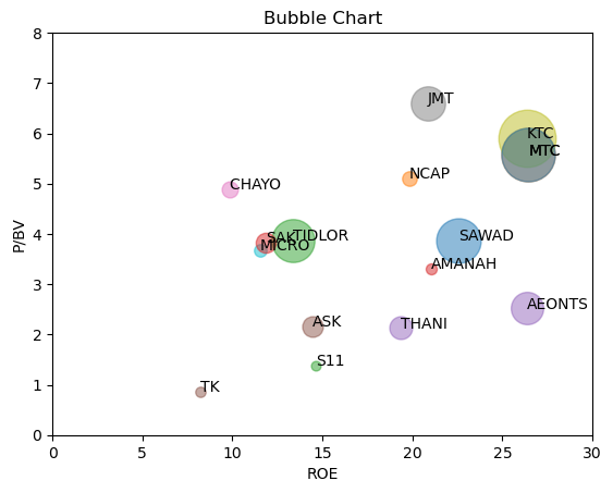
Conclusion
In this tutorial, we demonstrated how to create a bubble chart to visualize equity data using Python’s pandas and matplotlib libraries. This technique allows us to display various factors, such as ROE and P/BV, on the x and y axes, while the bubble size represents market capitalization. You can customize this chart further by choosing different data points for the axes, depending on your specific analysis needs.