Outlier techniques are crucial for data cleansing and eliminating noise
In this example, we used Python, the Pandas library, and the yfinance library to import and analyze financial data. We demonstrated how to clean data manually, standardize data using the StandardScaler, robust scaling with the RobustScaler, and normalization using quantile filtering. These techniques help improve the quality of data analysis by eliminating extreme values and focusing on more representative data points.
Step 1: Import pandas and matplotlib Start by importing the necessary libraries:
import yfinance as yf
import pandas as pd
import numpy as np
import matplotlib.pyplot as plt
Step 2: Import Dataframe from Excel Read the data from an Excel file and store it in a dataframe:
start = '2018-01-01'
end = '2021-01-01'
data = yf.download('CL=F PTTEP.BK', start=start, end=end, periods=1)
# CL=F  -> WTI3 Oil price
    [*********************100%***********************]  2 of 2 completed
# compare oilprice with PTTEP oil equity
df.dropna(inplace=True)
# clean data
df
Here’s what the dataframe should look like:
| CL=F | PTTEP.BK | |
|---|---|---|
| Date | ||
| 2018-01-03 | 61.630001 | 80.119003 |
| 2018-01-04 | 62.009998 | 83.671089 |
| 2018-01-05 | 61.439999 | 84.460434 |
| 2018-01-08 | 61.730000 | 83.276405 |
| 2018-01-09 | 62.959999 | 84.460434 |
| … | … | … |
| 2020-12-23 | 48.119999 | 86.777565 |
| 2020-12-24 | 48.230000 | 87.233093 |
| 2020-12-28 | 47.619999 | 86.549805 |
| 2020-12-29 | 48.000000 | 89.055191 |
| 2020-12-30 | 48.400002 | 89.510719 |
709 rows × 2 columns
df.loc['2020-04-15':'2020-04-24']| CL=F | PTTEP.BK | |
|---|---|---|
| Date | ||
| 2020-04-15 | 19.870001 | 70.167038 |
| 2020-04-16 | 19.870001 | 66.356049 |
| 2020-04-17 | 18.270000 | 68.597801 |
| 2020-04-20 | -37.630001 | 70.839561 |
| 2020-04-21 | 10.010000 | 68.373619 |
| 2020-04-22 | 13.780000 | 67.028572 |
| 2020-04-23 | 16.500000 | 68.149452 |
| 2020-04-24 | 16.940001 | 68.373619 |
709 rows × 2 columns
df.pct_change().plot()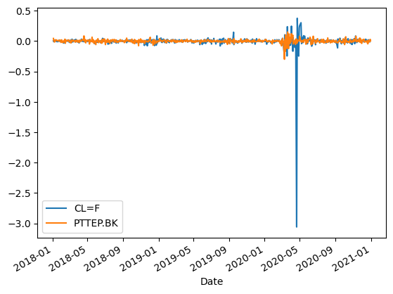
df.pct_change().plot.kde()
plt.xlim(-3,3)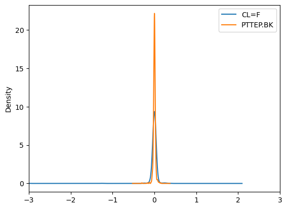
import seaborn as sns
sns.pairplot(df.pct_change())
plt.show()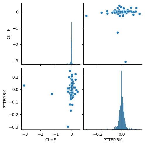
we demonstrated how to clean outlier data manually using Python and the Pandas library. First, we computed the percentage change for the given data:
df_ret = df.pct_change()
df_ret.loc['2020-04-15':'2020-04-24']
| CL=F | PTTEP.BK | |
|---|---|---|
| Date | ||
| 2020-04-15 | -0.011934 | -0.027950 |
| 2020-04-16 | 0.000000 | -0.054313 |
| 2020-04-17 | -0.080523 | 0.033784 |
| 2020-04-20 | -3.059661 | 0.032680 |
| 2020-04-21 | -1.266011 | -0.034810 |
| 2020-04-22 | 0.376623 | -0.019672 |
| 2020-04-23 | 0.197388 | 0.016722 |
| 2020-04-24 | 0.026667 | 0.003289 |
Then, we identified the outliers using a threshold of more than -1 standard deviation and 1 standard deviation:
df_ret.loc[(df_ret['CL=F']<-1)|(df_ret['CL=F']>1)]
#check is over more than - 1 sd and 1 sd| CL=F | PTTEP.BK | |
|---|---|---|
| Date | ||
| 2020-04-20 | -3.059661 | 0.03268 |
| 2020-04-21 | -1.266011 | -0.03481 |
We removed the outliers by appending the data before and after the removal period:
start_remove = '2020-04-17'
end_remove = '2020-04-22'
df_remove = df_ret.loc[:start_remove].append(df_ret.loc[end_remove:])
df_remove
| CL=F | PTTEP.BK | |
|---|---|---|
| Date | ||
| 2018-01-03 | NaN | NaN |
| 2018-01-04 | 0.006166 | 0.044335 |
| 2018-01-05 | -0.009192 | 0.009434 |
| 2018-01-08 | 0.004720 | -0.014019 |
| 2018-01-09 | 0.019925 | 0.014218 |
| … | … | … |
| 2020-12-23 | 0.023394 | -0.023077 |
| 2020-12-24 | 0.002286 | 0.005249 |
| 2020-12-28 | -0.012648 | -0.007833 |
| 2020-12-29 | 0.007980 | 0.028947 |
| 2020-12-30 | 0.008333 | 0.005115 |
707 rows × 2 columns
df_remove.loc['2020-04-15':'2020-04-24']| CL=F | PTTEP.BK | |
|---|---|---|
| Date | ||
| 2020-04-15 | -0.011934 | -0.027950 |
| 2020-04-16 | 0.000000 | -0.054313 |
| 2020-04-17 | -0.080523 | 0.033784 |
| 2020-04-22 | 0.376623 | -0.019672 |
| 2020-04-23 | 0.197388 | 0.016722 |
| 2020-04-24 | 0.026667 | 0.003289 |
707 rows × 2 columns
df_remove.plot()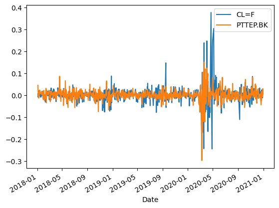
After cleaning the data, we demonstrated different methods for data transformation. First, we standardized the data using the StandardScaler from the sklearn library:
from sklearn import preprocessing
from sklearn.preprocessing import StandardScaler
from sklearn.preprocessing import RobustScaler
scaler = StandardScaler()
scaler.fit(df)
    StandardScaler()
df_std = scaler.transform(df)
df_std = pd.DataFrame(df_std, columns=df.columns)
df_std| CL=F | PTTEP.BK | |
|---|---|---|
| 0 | 0.589278 | -1.210682 |
| 1 | 0.617857 | -0.979414 |
| 2 | 0.574989 | -0.928022 |
| 3 | 0.596799 | -1.005111 |
| 4 | 0.689305 | -0.928022 |
| … | … | … |
| 704 | -0.426787 | -0.777159 |
| 705 | -0.418514 | -0.747500 |
| 706 | -0.464391 | -0.791988 |
| 707 | -0.435812 | -0.628868 |
| 708 | -0.405728 | -0.599210 |
709 rows × 2 columns
df.mean()
    CL=F        53.794725
    PTTEP.BK    98.714088
    dtype: float64
df.std()
CL=F 13.305778
PTTEP.BK 15.370026
dtype: float64import matplotlib.pyplot as pltdf_std.plot.kde()
plt.xlim(-3,3)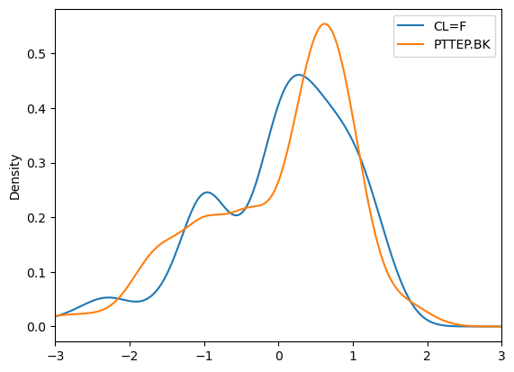
df_std.plot.hist(bins=[-3,-2,-1,0,1,2,3])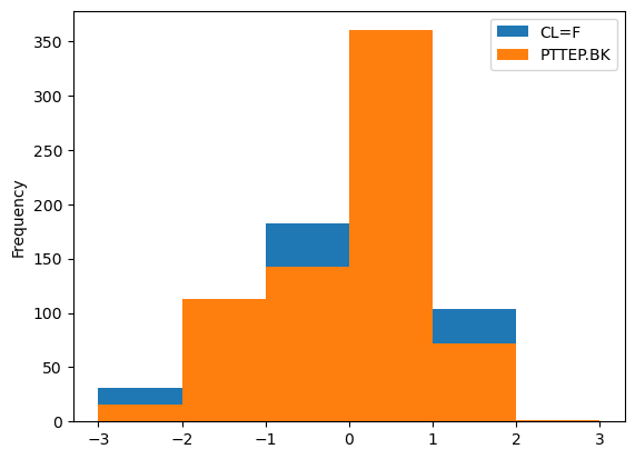
import seaborn as sns
sns.pairplot(df_std)
plt.show()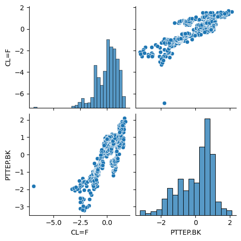
df_std.loc[(df_std > 3).any(axis=1)|(df_std<-3).any(1)]| CL=F | PTTEP.BK | |
|---|---|---|
| 522 | -1.887333 | -3.026275 |
| 523 | -2.018948 | -3.040871 |
| 524 | -2.513819 | -3.099254 |
| 525 | -2.149059 | -3.216018 |
| 527 | -2.288946 | -3.186827 |
| 545 | -6.875905 | -1.814844 |
| 546 | -3.292978 | -1.975396 |
| 547 | -3.009443 | -2.062969 |
| 550 | -3.084651 | -1.931609 |
| 551 | -3.117743 | -1.931609 |
outlier_3sd = df_std.loc[~((df_std > 3).any(1) | (df_std < -3).any(1))]outlier_3sd.plot.hist()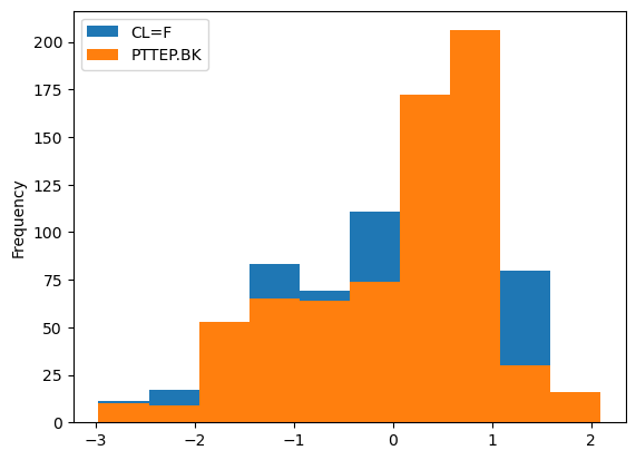
outlier_3sd.plot.kde()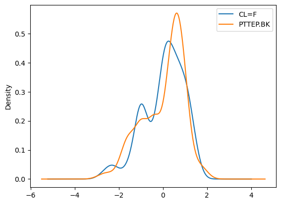
import seaborn as sns
sns.pairplot(outlier_3sd)
plt.show()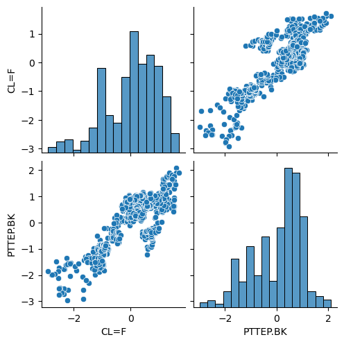
Next, we used robust scaling with the RobustScaler:
transformer = RobustScaler( quantile_range=(25.0, 75.0)).fit(df)df_robust=transformer.transform(df)
df_robust
array([[ 0.29773111, -1.07570019],
[ 0.31876029, -0.91572879],
[ 0.28721631, -0.88017993],
...,
[-0.47758723, -0.78608323],
[-0.45655784, -0.6732509 ],
[-0.43442162, -0.65273577]])df_robust = pd.DataFrame(df_robust,columns=df.columns)
df_robust
| CL=F | PTTEP.BK | |
|---|---|---|
| 0 | 0.297731 | -1.075700 |
| 1 | 0.318760 | -0.915729 |
| 2 | 0.287216 | -0.880180 |
| 3 | 0.303265 | -0.933504 |
| 4 | 0.371334 | -0.880180 |
| … | … | … |
| 704 | -0.449917 | -0.775826 |
| 705 | -0.443830 | -0.755311 |
| 706 | -0.477587 | -0.786083 |
| 707 | -0.456558 | -0.673251 |
| 708 | -0.434422 | -0.652736 |
709 rows × 2 columns
df_robust.boxplot(figsize=(10,6))
plt.show()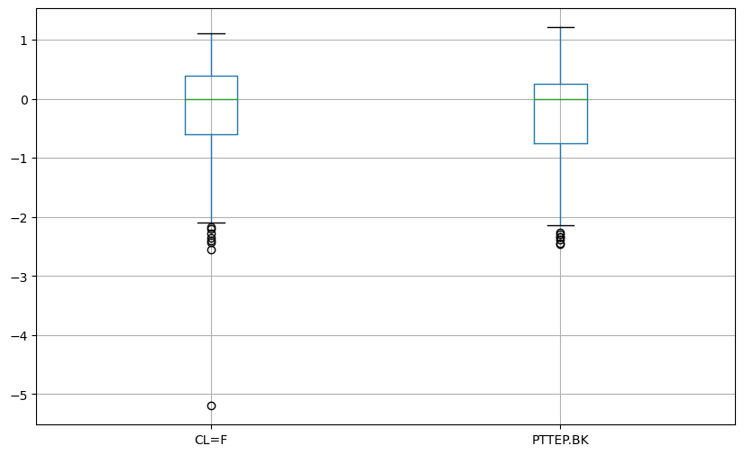
df_robust.plot.kde()
plt.xlim(-3,3)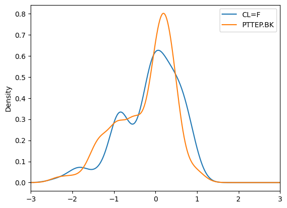
import seaborn as sns
sns.pairplot(df_robust)
plt.show()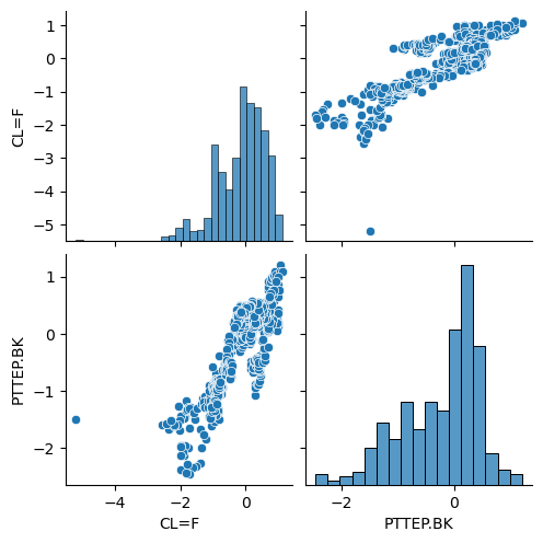
Normalized
df_normalized = pd.DataFrame(df,columns=df.columns)
df_normalized| CL=F | PTTEP.BK | |
|---|---|---|
| Date | ||
| 2018-01-03 | 61.630001 | 80.119003 |
| 2018-01-04 | 62.009998 | 83.671089 |
| 2018-01-05 | 61.439999 | 84.460434 |
| 2018-01-08 | 61.730000 | 83.276405 |
| 2018-01-09 | 62.959999 | 84.460434 |
| … | … | … |
| 2020-12-23 | 48.119999 | 86.777565 |
| 2020-12-24 | 48.230000 | 87.233093 |
| 2020-12-28 | 47.619999 | 86.549805 |
| 2020-12-29 | 48.000000 | 89.055191 |
| 2020-12-30 | 48.400002 | 89.510719 |
709 rows × 2 columns
We also demonstrated normalization using quantile filtering:
low = .05
high = .95
quant_df = df_normalized.quantile([low, high])
quant_df
| CL=F | PTTEP.BK | |
|---|---|---|
| 0.05 | 27.194 | 71.288631 |
| 0.95 | 70.966 | 116.598221 |
filt_df_x = df_normalized.apply(lambda x: x[(x>quant_df.loc[low,x.name])&  (x <= quant_df.loc[high,x.name])], axis=0)
filt_df_x
| CL=F | PTTEP.BK | |
|---|---|---|
| Date | ||
| 2018-01-03 | 61.630001 | 80.119003 |
| 2018-01-04 | 62.009998 | 83.671089 |
| 2018-01-05 | 61.439999 | 84.460434 |
| 2018-01-08 | 61.730000 | 83.276405 |
| 2018-01-09 | 62.959999 | 84.460434 |
| … | … | … |
| 2020-12-23 | 48.119999 | 86.777565 |
| 2020-12-24 | 48.230000 | 87.233093 |
| 2020-12-28 | 47.619999 | 86.549805 |
| 2020-12-29 | 48.000000 | 89.055191 |
| 2020-12-30 | 48.400002 | 89.510719 |
662 rows × 2 columns
filt_df_x.dropna()| CL=F | PTTEP.BK | |
|---|---|---|
| Date | ||
| 2018-01-03 | 61.630001 | 80.119003 |
| 2018-01-04 | 62.009998 | 83.671089 |
| 2018-01-05 | 61.439999 | 84.460434 |
| 2018-01-08 | 61.730000 | 83.276405 |
| 2018-01-09 | 62.959999 | 84.460434 |
| … | … | … |
| 2020-12-23 | 48.119999 | 86.777565 |
| 2020-12-24 | 48.230000 | 87.233093 |
| 2020-12-28 | 47.619999 | 86.549805 |
| 2020-12-29 | 48.000000 | 89.055191 |
| 2020-12-30 | 48.400002 | 89.510719 |
614 rows × 2 columns
alternative way
Q1 = df_normalized.quantile(0.05)
Q3 = df_normalized.quantile(0.95)
filt_manual_df = df_normalized[~((df_normalized < Q1) | (df_normalized > Q3 )).any(axis=1)]
filt_manual_df| CL=F | PTTEP.BK | |
|---|---|---|
| Date | ||
| 2018-01-03 | 61.630001 | 80.119003 |
| 2018-01-04 | 62.009998 | 83.671089 |
| 2018-01-05 | 61.439999 | 84.460434 |
| 2018-01-08 | 61.730000 | 83.276405 |
| 2018-01-09 | 62.959999 | 84.460434 |
| … | … | … |
| 2020-12-23 | 48.119999 | 86.777565 |
| 2020-12-24 | 48.230000 | 87.233093 |
| 2020-12-28 | 47.619999 | 86.549805 |
| 2020-12-29 | 48.000000 | 89.055191 |
| 2020-12-30 | 48.400002 | 89.510719 |
614 rows × 2 columns
filt_manual_df.plot()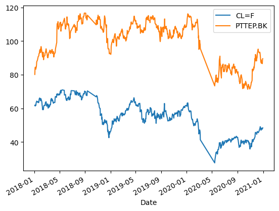
minmax scaler
Lastly, we scaled the data using the MinMaxScaler:
from sklearn.preprocessing import MinMaxScalerscaler = MinMaxScaler()scaler.fit(df_normalized)
MinMaxScaler()df_normal_scaled = scaler.transform(df_normalized)df_normal_scaled
array([[0.87039633, 0.37746131],
[0.87372847, 0.42099251],
[0.86873023, 0.43066602],
...,
[0.74754469, 0.45627149],
[0.75087686, 0.48697528],
[0.75438442, 0.49255782]])df_normal_scaled = pd.DataFrame(df_normal_scaled,columns=df.columns)df_normal_scaled| CL=F | PTTEP.BK | |
|---|---|---|
| 0 | 0.870396 | 0.377461 |
| 1 | 0.873728 | 0.420993 |
| 2 | 0.868730 | 0.430666 |
| 3 | 0.871273 | 0.416156 |
| 4 | 0.882059 | 0.430666 |
| … | … | … |
| 704 | 0.751929 | 0.459063 |
| 705 | 0.752894 | 0.464645 |
| 706 | 0.747545 | 0.456271 |
| 707 | 0.750877 | 0.486975 |
| 708 | 0.754384 | 0.492558 |
709 rows × 2 columns
df_normal_scaled.boxplot(figsize=(10,6))
plt.show()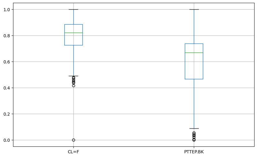
import seaborn as sns
sns.pairplot(df_normal_scaled)
plt.show()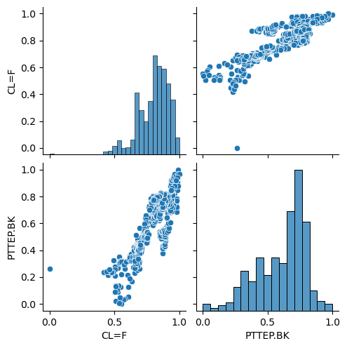
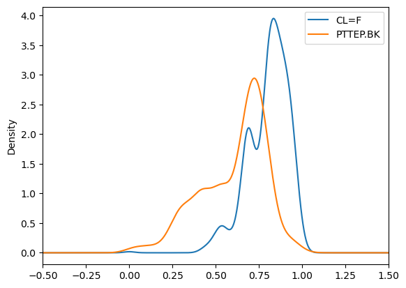
df_normal_scaled.plot.kde()
plt.xlim(-.5,1.5)