
A guide to creating a data visualization that compares Google Trends data with Bitcoin price, helping to analyze public interest and sentiment in the cryptocurrency market
Import pandas and matplotlib
import pandas as pd
import numpy as np
import matplotlib.pyplot as plt
import seaborn as sns
install pytrends and import
!pip install pytrendsfrom pytrends.request import TrendReqpytrends = TrendReq(hl='en-US', tz=360)
pytrends.suggestions(keyword='bitcoin')
result from pytrends
[{'mid': '/m/05p0rrx', 'title': 'Bitcoin', 'type': 'Cryptocurrency'},
     {'mid': '/g/11fzz0b6bd',
      'title': 'The Bitcoin Standard: The Decentralized Alternative to Central Banking',
      'type': 'Book by Saifedean Ammous'},
     {'mid': '/g/11g24jzg8x',
      'title': 'Cryptocurrency Investing For Dummies',
      'type': 'Book by Kiana Danial'},
     {'mid': '/g/11fx8y_lzq',
      'title': 'Mastering Bitcoin: Programming the Open Blockchain',
      'type': 'Book by Andreas Antonopoulos'},
     {'mid': '/g/11h2fx5fh8',
      'title': 'Bitcoin: A Peer-to-Peer Electronic Cash System',
      'type': 'Book by Satoshi Nakamoto'}]
# we must work use one by one keyword search google trend
kw_1 = ['bitcoin']
cat = 0
geo = ''
timeframe = '2020-01-01 2023-01-01'pytrends.build_payload(kw_1, cat=cat, timeframe=timeframe, geo=geo, gprop='')
data = pytrends.interest_over_time()
# use interest over time
app = pytrends.interest_by_region(resolution='COUNTRY')
appwe will see data like this
| bitcoin | |
|---|---|
| geoName | |
| Afghanistan | 0 |
| Albania | 0 |
| Algeria | 0 |
| American Samoa | 0 |
| Andorra | 0 |
| … | … |
| Western Sahara | 0 |
| Yemen | 0 |
| Zambia | 0 |
| Zimbabwe | 0 |
| Åland Islands | 0 |
250 rows × 1 columns
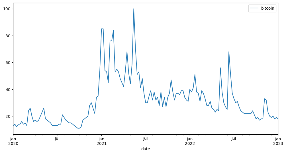
try to plot chart
%matplotlib inline

data.plot(figsize = (12,6))
let try compare with btc price
import yfinance as yfprice = yf.download('BTC-USD', start='2020-01-01', end='2023-01-01')[*****************100%*******************] 1 of 1 completed
price| Open | High | Low | Close | Adj Close | Volume | |
|---|---|---|---|---|---|---|
| Date | ||||||
| 2020-01-01 | 7194.892090 | 7254.330566 | 7174.944336 | 7200.174316 | 7200.174316 | 18565664997 |
| 2020-01-02 | 7202.551270 | 7212.155273 | 6935.270020 | 6985.470215 | 6985.470215 | 20802083465 |
| 2020-01-03 | 6984.428711 | 7413.715332 | 6914.996094 | 7344.884277 | 7344.884277 | 28111481032 |
| 2020-01-04 | 7345.375488 | 7427.385742 | 7309.514160 | 7410.656738 | 7410.656738 | 18444271275 |
| 2020-01-05 | 7410.451660 | 7544.497070 | 7400.535645 | 7411.317383 | 7411.317383 | 19725074095 |
| … | … | … | … | … | … | … |
| 2022-12-27 | 16919.291016 | 16959.845703 | 16642.072266 | 16717.173828 | 16717.173828 | 15748580239 |
| 2022-12-28 | 16716.400391 | 16768.169922 | 16497.556641 | 16552.572266 | 16552.572266 | 17005713920 |
| 2022-12-29 | 16552.322266 | 16651.755859 | 16508.683594 | 16642.341797 | 16642.341797 | 14472237479 |
| 2022-12-30 | 16641.330078 | 16643.427734 | 16408.474609 | 16602.585938 | 16602.585938 | 15929162910 |
| 2022-12-31 | 16603.673828 | 16628.986328 | 16517.519531 | 16547.496094 | 16547.496094 | 11239186456 |
1096 rows × 6 columns
Clean data
# match day with google trend
df =price.resample('W',origin='2020-01-05').last()
datax = data.drop('isPartial', axis=1)Plot Chart
fig, ax1 = plt.subplots(figsize = (12,6))
ax1.plot(price['Close'], label='BTC-USD')
ax1.set_xlabel('Date')
ax1.set_ylabel('BTC-USD Price')
ax1.legend(loc = 'upper left', labels=['BTC-USD Price'])

ax2 = ax1.twinx()
ax2.plot(datax, 'r', label='Google Trends')
ax2.set_ylabel('Google Trends')
ax2.legend(loc = 'upper right', labels=['Google Trends'])

plt.show()
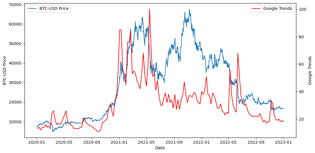
Note
We will see in 2022-01 Google Trend indicator is less more than 2021-01 , 2021-05 maybe it mean people not interesting and price is over natural or retail is not interesting maybe it mean this is bear market signal
By the way, it may be used in a variety of hypotheses and can be improved depending on the idea.
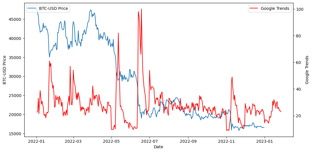
try to filter only 2022-2023
start_date = '2022-01-01'
end_date = '2023-01-01'

price_filtered = price.loc[start_date:end_date]price_filtered| Open | High | Low | Close | Adj Close | Volume | |
|---|---|---|---|---|---|---|
| Date | ||||||
| 2022-01-01 | 46311.746094 | 47827.312500 | 46288.484375 | 47686.812500 | 47686.812500 | 24582667004 |
| 2022-01-02 | 47680.925781 | 47881.406250 | 46856.937500 | 47345.218750 | 47345.218750 | 27951569547 |
| 2022-01-03 | 47343.542969 | 47510.726562 | 45835.964844 | 46458.117188 | 46458.117188 | 33071628362 |
| 2022-01-04 | 46458.851562 | 47406.546875 | 45752.464844 | 45897.574219 | 45897.574219 | 42494677905 |
| 2022-01-05 | 45899.359375 | 46929.046875 | 42798.222656 | 43569.003906 | 43569.003906 | 36851084859 |
| … | … | … | … | … | … | … |
| 2022-12-27 | 16919.291016 | 16959.845703 | 16642.072266 | 16717.173828 | 16717.173828 | 15748580239 |
| 2022-12-28 | 16716.400391 | 16768.169922 | 16497.556641 | 16552.572266 | 16552.572266 | 17005713920 |
| 2022-12-29 | 16552.322266 | 16651.755859 | 16508.683594 | 16642.341797 | 16642.341797 | 14472237479 |
| 2022-12-30 | 16641.330078 | 16643.427734 | 16408.474609 | 16602.585938 | 16602.585938 | 15929162910 |
| 2022-12-31 | 16603.673828 | 16628.986328 | 16517.519531 | 16547.496094 | 16547.496094 | 11239186456 |
365 rows × 6 columns
fig, ax1 = plt.subplots(figsize = (12,6))
ax1.plot(price_filtered['Close'], label='BTC-USD')
ax1.set_xlabel('Date')
ax1.set_ylabel('BTC-USD Price')
ax1.legend(loc = 'upper left', labels=['BTC-USD Price'])

ax2 = ax1.twinx()
ax2.plot(daily.bitcoin, 'r', label='Google Trends')
ax2.set_ylabel('Google Trends')
ax2.legend(loc = 'upper right', labels=['Google Trends'])

plt.show()
Conclusion
Overall The idea of comparing Google Trends data with Bitcoin (BTC) price is to monitor the public’s interest and sentiment towards the cryptocurrency. Google Trends is a free tool that shows how often specific search terms are entered into Google search over a certain time period. By tracking searches related to Bitcoin, you can gauge the attention it receives from the general public.
To compare the two sets of data, plot them on a line graph with the BTC price on the y-axis and Google Trends data on the x-axis. Visually examining the graph can reveal patterns or correlations between the data.
However, keep in mind that correlation does not imply causation. A relationship between BTC price and Google Trends data doesn’t mean one causes the other. Other factors can drive changes in BTC price, such as regulatory developments, news events, or shifts in market sentiment.
Additionally, Google Trends data can be noisy and subject to manipulation. People or groups might inflate search volume for a term to create a false impression of interest. Also, searches can be misinterpreted or misreported. It’s important to be cautious and consider the data’s limitations when interpreting it.